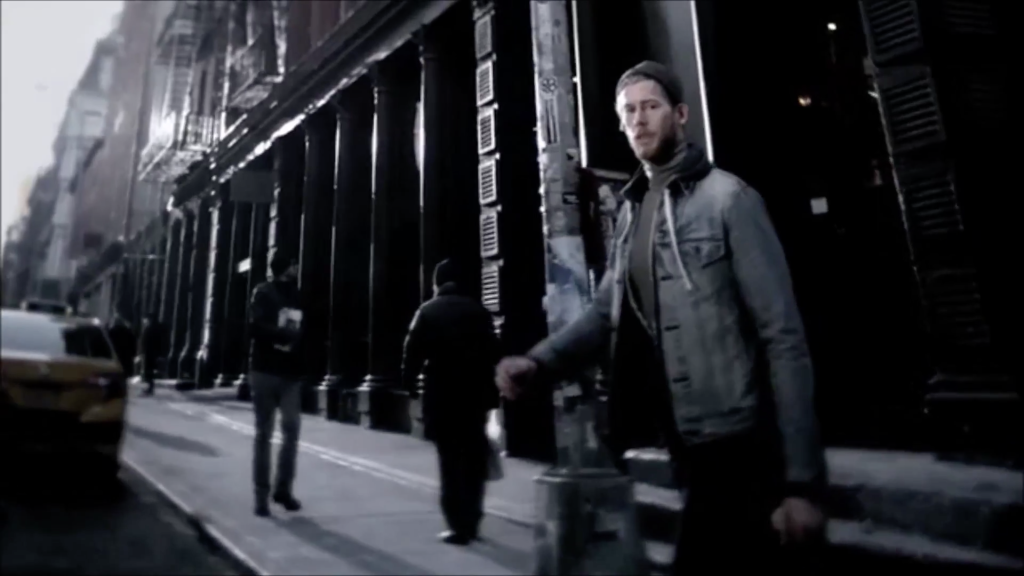
. . . get me down. Here you have the greatest branded good ever devised. Ever. And this incredible diversity of vehicle types, makes, models, features and audiences. And giant production budgets for shooting TV commercials. And giant-er media budgets for running said commercials. Yet so many of the ads that make it on air (or cable) manage to recycle the same buttons, beats, tropes and talking points that have already been recycled well past the point of banality.
Like the power slide. That’s when a stunt driver does a nifty little fishtail while bringing a car to a stop. Just like you do, with your car, three, four times a day.
Or the beautiful people behind the wheel. Days are spent casting models who look far better than anyone the vast majority of us even know. So we’ll be impressed, somehow, seeing someone who looks like a supermodel in an Impala. Because that’s what supermodels drive.
Or the running footage along the northern California coastline. Among the giant redwoods. Over the mountains. In and around San Francisco. Past that overhead walkway in downtown LA. Through the 2nd Street Tunnel in LA. Over, under or around the 6th Street Bridge in LA.
Or the salt flats. Don’t forget the salt flats. Because nothing says . . . actually, I’m not sure what it says about a car that it can operate on salt flats. Can’t they all?
There’s any number of automotive clichés you’ve been seeing as long as you’ve been watching television. Too often, when confronted with the choice between doing something new and something familiar, car companies and their advertising agencies choose familiar.
I don’t get it.
I mean, I do, but I don’t.
In sum, I spent well over eight years of my adult life working on advertising for automotive brands. So, yes, I understand how so many clichés end up in so many commercials for so many car brands: The stakes of failure are great in the car business, a lot of folks who make the day-to-day advertising decisions hide behind the safety and comfort of the same old same old. It’s “no one ever got fired for . . . ,” only in this case, the rest of that sentence is “. . . using innocuous yet unmemorable running footage.”
I do get that.
What I don’t get is why so few carmakers, institutionally, try to do something legitimately interesting and distinctive and memorable with their ads.
Wait, I get that, too.
Not all of them are even making legitimately interesting and distinctive and memorable cars. Why should the ads be any different?
Likewise, the folks approving the decisions – senior management – may be just as cautious and aesthetically reactionary as the folks making the decisions. After all, they’re the ones who field the complaints from dealers when the commercials don’t look like the commercials have always looked.
And there’s the problem when folks at the top – senior senior management – don’t really have a lot of day-in, day-out experience or expertise when it comes to marketing, communication and advertising.
For instance, there was a time when one of the big car companies in town (I’m not naming names) would shuffle a new mucky muck into the top of the org chart and the mucky muck in question would instantly become the World’s Greatest Expert On Advertising.
Even if he got the job for being the guy who handled labor. Or a “plant rat” with deep experience out in the field. Or an engineer. Or an accountant. The new title would inevitably bring with it magical new wisdom when it came to advertising.
The point being the whole enterprise of designing, engineering, manufacturing, distributing and selling cars seems to conspire against even trying for something great when it comes to advertising them. That’s why so many car commercials look and sound the same. Or at least similar enough that you have to wonder how many cars some of them sell.
So, when I said I didn’t get it, that was kind of a lie. I do get it. I just wish it was different. Not just as someone who works in the business of advertising. Not just as someone who makes Detroit his home . . . and the home for his business. But as someone who sees these commercials on television just like you do and wishes, if only for the sake of diversion, that they were better. More interesting. More thought provoking. More emotionally engaging. More memorable. Better.
What’s got me in this frame of mind is the newish Cadillac campaign from General Motors and that guy who had them move their marketing folks to New York because he didn’t want to take a job in Detroit (and let’s not kid ourselves about that).
You’ve probably seen it. It’s the campaign built around a bunch of shots of New York City and little pieces of philosophy from Steve Wozniak, Richard Linklater and other creative class types who don’t drive Cadillacs.
Sure, the celebrity who gets paid to push a car he or she doesn’t drive is another one of the many clichés in the automotive advertising handbook.
So is the “slo-mo creeping down city streets while steam rises from manhole covers” shot.
But I don’t care about that.
What got me going is the bit from a recent Cadillac lease spot . . . the moment captured in the screengrab featured at the top of this post: It’s the hip looking guy gazing with admiration upon what turns out to be an SRX. The vehicle, we are led to believe, is so stunning he’s caught midstride and can’t help but find himself transfixed by its loveliness.
This is the automotive advertising cliché I hate above all others.
You see it all the time. For expensive cars, cheap cars, in between cars: Some man or some woman is so struck by the magnificent beauty – or the beautiful magnificence – of the all new 2015 Make Model he or she can’t help but gape, slack jawed in appreciation, at this miracle of rolling design.
I’m sure we’ve all had moments out in the real world when we’ve experienced a not dissimilar reaction to some car or other. If by “some car or other” we mean Bentley or Rolls Royce or Lamborghini. It’s not a reaction we have to every Ford, Jeep or Chevy to come along. No matter what advertising may tell us. And however nice those cars may be (full disclosure: I drive a Jeep and I think it looks just fine).
I have two reasons for hating this cliché:
One, it’s easy, cheap and lazy. It’s a cop out. Anyone can do it. It doesn’t make it true.
Second, it’s a way of talking down to you, the viewer. And I don’t like seeing you talked down to.
Look at it this way: Whether you personally like Cadillac’s design palette or not, the brand makes a strong and unique visual statement. Since the launch of the original CTS, Cadillac has featured aggressive, dramatic and distinctive styling. The look is idiosyncratic and highly branded. Good on them.
But when they reduce the brand to showing some hipster doing a double take at the SRX, what they’re saying is this:
“We at Cadillac think you the viewer are too stupid to understand that we make dramatically styled cars unless we show you someone staring at a Cadillac.”
General Motors, Cadillac marketing, the ad agency, the creative team, the production company and the director . . . they all think you’re a moron.
You see, when a car brand uses the staring-in-wonder cliché, it usually means they aren’t wholly confident the car itself conveys excellent design. But when a brand with exterior styling as distinctive as Cadillac’s chooses to larder it on, it means they worry theirs is an audience of imbeciles.
Bottom line: It’s easy, it’s cheap, it’s a little cynical. But most of all, it’s just the same as everybody else.
Which is how it got to be a cliché in the first place.
ml
4.21.2015


